


Neutral colors—with names such as beige, tan, gray, and taupe—are often considered staples of design because they go with almost everything and give way for other colors to stand out as accents. Using them is deceptively simple, but there are a wide range of factors to consider in choosing which neutral hue to use, and how.
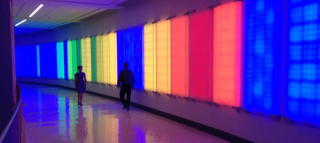
One of the working definitions for a color to be considered “neutral” is to describe it as not appearing on the color wheel. Variations of black, white, and gray are commonly considered neutrals, and most will also put brown and off-whites into the neutral category. All the neutral tints, shades, and hues available, along with the wide variety of applications for their use, mean choosing a neutral is not always easy. Ruth Jansson, principal, director of interiors for LEO A DALY, says she finds neutrals “more difficult than anything else.” Here are three tips from experts like Jansson on how to choose the right neutral for your design:
1. Evaluate the lighting
Find out which type of light the paint will be exposed. Within neutrals are shades and hints of other colors, and whether the room has natural, incandescent, or fluorescent lighting could mean that the off-white shade on the wall winds up with a greenish tint. Jansson recommends designers evaluate their color choices in different lighting environments at different times of the day. “The hue differences in neutrals can show up at different times of the day when the light changes,” Jansson advises. “Strong colors are much more forgiving and less nuanced than neutrals.”
2. Know who and what the space is used for
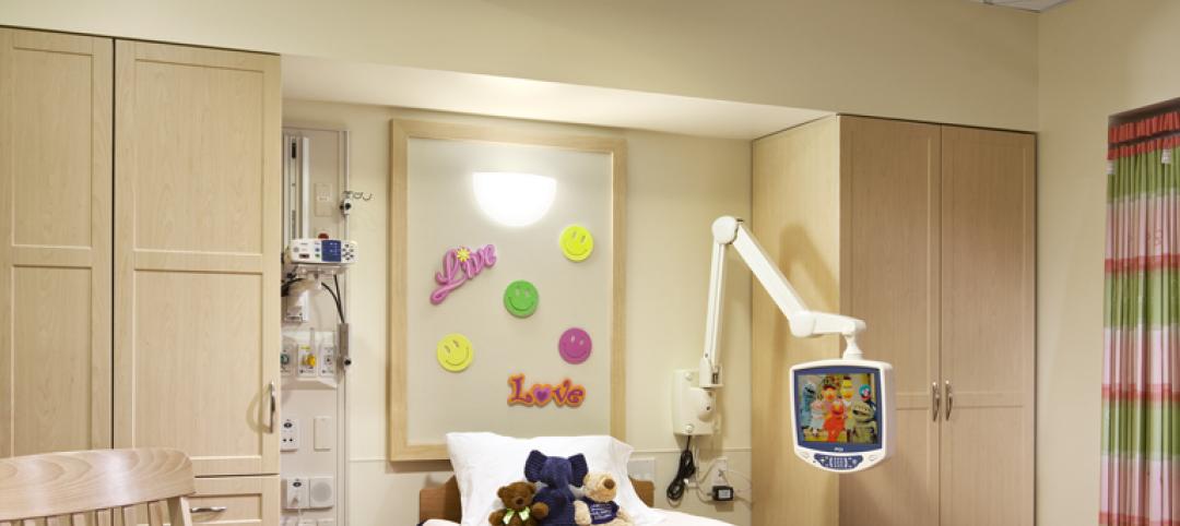
Kimberly Overton, associate, director of interiors at LEO A DALY, keeps the culture of the project in mind when choosing color palettes. For her recent healthcare projects, Overton focused on using colors and textures to give more of a spa-like feel rather than that of a traditional hospital institution. For the Zayed Military Hospital in Abu Dhabi, Overton knew that texture and patterns would be very important, so she chose sophisticated materials like marble and primarily used a creamy white hue, relying on bright-colored furniture to provide accents.
The demographic of intended occupants is also important because different age groups perceive and respond to colors differently. For an elementary school project, Overton not only considered how teachers would be decorating the room with different colors, but also that too many strong colors could over-stimulate a child. For corporate environments or more established brands, sparse and muted colors can be employed to correct tone.
3. Think long-term
Be wary of choosing colors that are currently trending to pair with the timelessness of neutrals. In the time it takes to plan and implement projects, the accent color could lose its popularity. Patricia Miller, LEO A DALY’s corporate director of hospitality, places importance on picking colors with staying power because it is common not to remodel for another five years or more.
Related Stories

Architects | Aug 5, 2020
Final report: BD+C's 2020 Color Trends Report
This special research report from the editors of BD+C explores the leading trends and drivers related to the use of color on commercial, institutional, and multifamily building projects.

Sponsored | | Jan 15, 2018
Innovations Pave the Way for High-Performing Metallic Coatings
Valspar's durable metallic coating systems are made to last while providing a vibrant sparkle

Sponsored | | Oct 10, 2017
Tracing Color Trends and the Paint Industry Through the Years
Innovations in technology mean today's architects have endless options when it comes to coating options.

Sponsored | | Sep 6, 2017
Special Effects: Going Beyond the Color Spectrum for Exteriors
AEC teams have endless options when it comes to choosing hues and effects for architectural coatings

Sponsored | | Jun 14, 2017
Psychology in the Coloring of Built Environments
Expert says some of color trend research really comes down to human psychological and emotional responses

Sponsored | | Apr 26, 2017
Advancements in Materials Open Up Color Trend Possibilities
For color experts, predicting trends before they happen requires a trained eye and being able to understand people

Sponsored | Color Innovations Series | Aug 9, 2015
Campus Branding With Color
Iconic and identifiable colors play role in higher ed branding on campuses. - See more at: http://www.bdcnetwork.com/campus-branding-color#sthash.ijEP68Iy.dpuf
Sponsored | | May 22, 2015
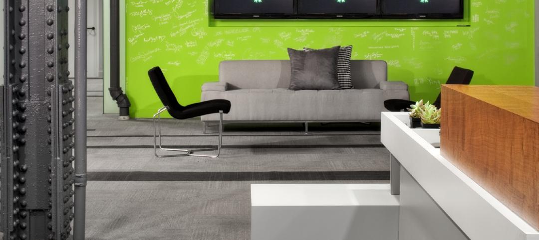
Shades of Gray—And One Green
Many companies utilize their signature colors for the exterior and interior of their office suites, buildings, and more. But for a product strategy and design firm in Austin, Texas, just one simple hue was needed to represent the brand.


