

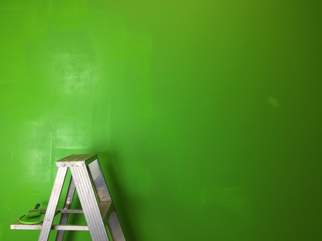
In an environment where the chief task is to heal the sick and injured, color matters for both patients and healthcare personnel. In the report, “The Application of Color in Healthcare Settings,” by the Center for Health Design (CHD), healthcare design experts point to the influence of color in a variety of environments within healthcare facilities. From bright, open-air lobbies to neutral-toned operating rooms, there are many spaces where carefully selecting color can maximize comfort for occupants.
About the Report
“The Application of Color in Healthcare Settings” serves as a reference for architects and designers with regards to the application of color to healthcare spaces. Released October 2012 by The Center for Health Design, the report looks at studies of color in a variety of healthcare settings and offers insight on applicable color topics.
Authors:
Sheila J. Bosch, LEED AP, EDAC, Director of Research at Gresham, Smith, and Partners;
Rosalyn Cama, FASID, EDAC, President and Principal of CAMA Inc.
Eve Edelstein, Assoc. AIA, EDAC, F-AAA, President of Innovative Design Science
Jain Malkin, CID, AAHID, EDAC, President of Jain Malkin Inc.
1. Patient rooms: Make patients feel at home
There lacks a universally accepted consensus that colors can actually “help” patients heal, according to the study’s authors. Nevertheless, colors will be used to evoke certain emotions or moods. In a 1994 study of 68 subjects, all patients indicated a preference for lighter hues for their rooms—from the ceilings and floors to the furniture and linens.
Neutral palettes with soft natural tones work best for patient rooms and can have a hand in calming patients and their family members faced with the stress of having an ill loved one, according to the study. Avoid using palettes with strongly contrasting colors in these spaces, as they are known to cause strain for occupants.
Similar design considerations should be made where patients and their family members will spend time, such as waiting areas in emergency departments.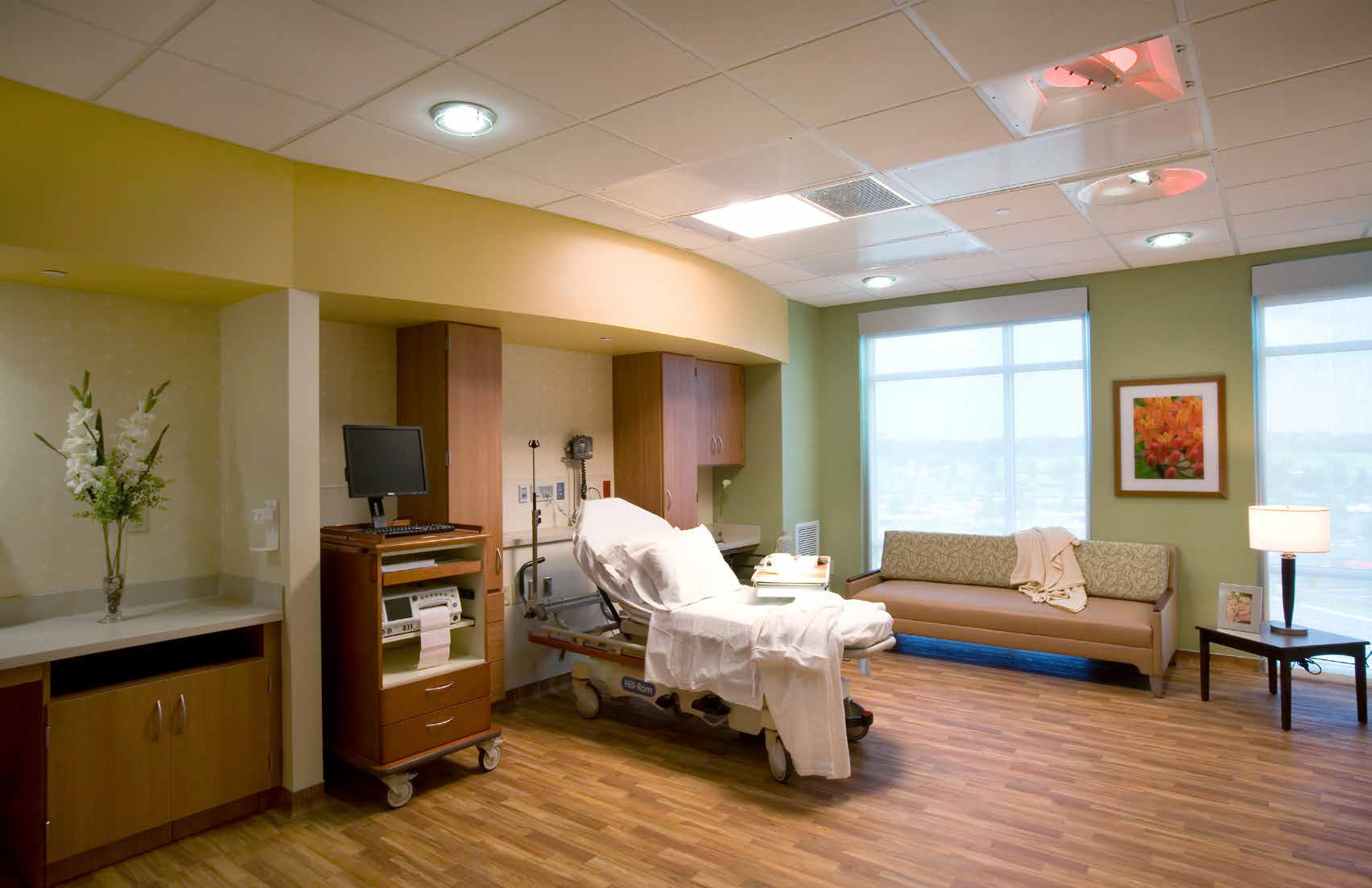
2. Employee spaces: Increase comfort for doctors and nurses
Professionals providing the care in healthcare environments are known for working long, stressful shifts, standing for hours on end. They need places of respite to rest and recharge. Brightly lit rooms with stronger color palettes can help those needing a quick break to stay fresh and lively. Darker, subtler break rooms with softer lighting are preferred by many workers looking to rest for longer periods of time.
3. Operating rooms: Neutralize the reds
In the operating room, surgeons and surgical nurses are focused on one color: blood red. While white is traditionally seen as the institutional color of choice, more often than not operating rooms will require the use of blue or green on the walls to contrast against the red. (There’s a reason hospital scrubs are commonly colored blue or green.) Viewing one color for a specific amount of time will produce an image of a complementary color afterward (called afterimages), so it is best to avoid stark white backgrounds, say the authors. With white walls, surgeons would constantly see blue-green spots when looking away from the operating table.
4. Accommodations: Consider patient conditions and age
Children’s hospitals are often colorful and bright in their design to help pediatric patients feel at home during their stay. In contrast, nursing homes are softer and more neutral. With elderly populations, vision is changing and deteriorating, so greater contrast is needed to help guide patients through their rooms. Consider saturated colors over pastels, which can blur together in patients with poorer eyesight.
Take into account the medical conditions of certain patients. One example in the CHD report is jaundice, or yellowing of the skin. Doctors and nurses treating those with the condition may find difficulty while assessing patients if yellow and blue walls or surfaces are dominant.
5. Color psychology: Apply colors to different spaces
While there is no concrete scientific evidence supporting its effects, the use of color psychology can help enhance the function of a space or room. Natural colors, such as green, blue, or brown, are seen as calming, and can signal the designation of a room. Red, while a stimulating color especially for creative types, is often avoided in facilities that treat neurological conditions or patients suffering from ailments such as post-traumatic stress disorder.
Related Stories
Adaptive Reuse | Mar 26, 2024
Adaptive Reuse Scorecard released to help developers assess project viability
Lamar Johnson Collaborative announced the debut of the firm’s Adaptive Reuse Scorecard, a proprietary methodology to quickly analyze the viability of converting buildings to other uses.

Contractors | Aug 14, 2023
Fast-tracking construction projects offers both risk and reward
Understanding both the rewards and risk of fast-tracking a project can help owners, architects, engineers, and contractors maximize the benefits of this strategy and can bring great reward on all fronts when managed properly.

Steel Buildings | Feb 21, 2023
AISC releases SpeedCore design guide for building concrete-filled composite steel plate shear wall core systems
The American Institute of Steel Construction has released Design Guide 38, SpeedCore Systems for Steel Structures. The document pertains to the nonproprietary concrete-filled composite steel plate shear wall core system that “shaved a whopping 10 months off the erection schedule of Seattle’s 58-story Rainier Square,” according to AISC.

Projects | Mar 8, 2022
A scalable EV charging solution
Resembling a fueling station, VersiCharge XL—a new electric vehicle (EV) charging concept structure—can charge large numbers of EVs in outdoor areas ranging from small office building parking lots to last-mile logistics hubs to stadium parking lots.

Resources | Aug 4, 2020
AWC and ICC Release Mass Timber Buildings and the IBC
The publication provides an overview of requirements for mass timber construction as found in the 2015, 2018, and 2021 International Building Code.

Sponsored | | Dec 11, 2018
Clam Outdoors Turns Ice Into Gold
How precast helped fuel the growth of a Minnesotan institution

Sponsored | | Dec 5, 2018
Finders Keepers
Personal dashboard helps users organize precast projects and ideas
Sponsored | | Nov 15, 2018
Mind Your Beeswax
Load-bearing panels and functional aesthetics help personal care company upgrade facility

Sponsored | Build More Efficient Buildings Series | Jul 20, 2018
The Power of Understanding Uninterruptible Power Supply Systems
Highly reliable and efficient backup power systems are a key concern for building teams.

Sponsored | Precast Construction Advantages Series | Jul 5, 2018
A Construction Primer: Precast vs. Site-Cast
While the end products can look similar, the two styles offer differing results.


